Source: Wix
Warm Up
Visit the following websites that use parallax scrolling:
As you scroll down, observe the way different elements on the page move. Do all elements move at the same speed? What differences do you notice in the way this site implements parallax scrolling? Write your thoughts in your journal.
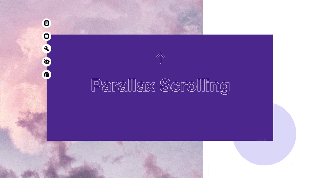
Introduction to Parallax Scrolling
Parallax scrolling is a web design technique where, as a user scrolls down a webpage, the background images move at a different speed than the content in the foreground. This creates an illusion of depth and it can make the website more engaging and visually appealing.
As a quick note, parallax scrolling can be a fun and engaging feature, but you should use it thoughtfully. Too much parallax scrolling, or scrolling that's too fast or slow, can be disorienting for users.
Implementing Parallax Scrolling
You’ll want to start with something like this in your HTML:
<div class="parallax-container">
    <div class="parallax-text">
      <h1>Parallax Effect</h1>
      <p>This text appears to float over the image as you scroll.</p>
    </div>
  </div>
🗣️ Let’s break down the HTML!
<div class="parallax-container">- Thisdivis the container for the parallax effect. It's like a stage on which the parallax action takes place. Everything related to the parallax effect will be inside thisdiv. The background image of thisdivwill be specified in the CSS.
<div class="parallax-text">- Thisdivcontains the text that will scroll over the background image. As the page scrolls, this text will appear to float above the image.
<h1>...</h1>and<p>…</p>- This is the text that will be displayed on the page. The title is inside anh1tag for prominent display, but you can use any suitable tag for your content.
Add this in your CSS, where you can change
image.jpg to any image you’d like:.parallax-container { display: flex; flex-direction: column; align-items: center; justify-content: center; min-height: 800px; background-attachment: fixed; background-image: url('image.jpg'); background-position: center; background-size: cover; } .parallax-text { color: rgb(60 60 60); text-align: center; }
🗣️ Let’s break down the CSS!
.parallax-container- This is the CSS rule for the parallax container.display: flex;- We are using Flexbox to lay out the items inside of our parallax container.flex-direction,align-itemsandjustify-contentare ensuring that we lay out our items in the way we desire.background-image: url('image.jpg');- This rule sets the background image of thediv. Replace'image.jpg'with the path to your own image.min-height: 800px;- The height of the image is set to 800px. You can increase the number to make it taller than the viewport. This allows the image to scroll at a different speed from the rest of the page, creating the parallax effect.background-attachment: fixed;- This rule ensures the background image is fixed in place, even when the rest of the page scrolls.background-position: center;This just simply centers the background image.background-size: cover;- This rule ensures the image covers the full width and height of the div, scaling the image as needed.
.parallax-text- This is the CSS rule for the text that will scroll over the image.color: rgb(60, 60, 60);- The text color is set to dark gray for contrast against the image, but you can choose any color that works with your image.text-align: center;- This centers the text within thediv.
Practice: Create Your Own Parallax Scrolling Website
Now that you've learned about parallax scrolling, it's time to create your own parallax scrolling website! Implement it on a previous website or project that you’ve worked on; or start a new one!
Your website should include at least one section with parallax scrolling. The parallax section should include a background image and some foreground content.
You can use the example code above as a starting point, but feel free to experiment and get creative! Try adding more parallax sections, using different scrolling speeds, or including other types of content in your parallax sections.